lighter and brighter
fun
gender neutral
kid-friendly, but not baby-ish
Minh (foolishly) agreed to go along with my plan. So, about a week and a half ago I gave the room a coat of primer and two coats of the lighter yellow. Minh spent a few minutes standing in the doorway shaking his head and asking "Are you sure that's the lighter yellow?....That's awfully yellow." And it is, really, quite yellow.
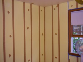
This past Sunday night we spent a good two hours measuring out and taping off the stripes. There was math involved and the math got even more complicated when we realized (after we had already taped off one whole wall) that I had measured the room inaccurately. So, Minh did some fudging--some of the stripes are actually 12.5" wide, and one or two are 11.75" wide. Here's how the room looked all taped off:

Kind of retro and 70's looking with the brown and yellow, eh? It's actually a brighter yellow than it looks here - the flash washed it out a bit.
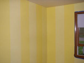
Anyway, last night was the big night. We painted on the brighter shade of yellow, with zero technical difficulties. No problems with painting the wrong stripes or with pulling the tape neatly off afterward. All went well. EXCEPT for the fact that the two shades of yellow are so similar you can barely see the stripes.
It really depends on the light, actually. Without the bright worklight on, it all looks like one shade of yellow. And with the usual halogen lamp on, it's pretty much a blur of yellow too. Oddly enough, when I take pictures of the walls the camera's flash lights it up just perfe
 ctly and it comes out looking like this:
But it does not actually look like this to the naked eye. This is unfortunate, because this is exactly what I want it to look like. So now we are trying to decide what action to take. The brighter stripes actually look great, so we are thinking about re-painting the lighter stripes even lighter. A very pale yellow? Or perhaps a shade of cream?
Anyone have any thoughts? If you want to make suggestions, you should know that the rug we've ordered for the room is a light slivery blue with circles all over it. The circles are darker blue, pale green, and cream. So we need something that will compliment those colors. And don't even try to talk me out of the combination of stripes on the walls and circles on the floor -- the rug has already been ordered. (And yes, I'm a tad worried all this mixing of patterns may cause seizures later in life).
4 comments:
I love it! I vote for the cream stripes if you don't like the light yellow!! See you guys soon!
Um, K? Step AWAY from the paintbrushes. I think the greatest danger of seizure might involve you in the Home Depot paint aisle.
It looks great, and really, even if it's a subtle difference, subtle is good. Really. Stop the madness.
I think the stripes look great in that second picture. Any chance you can find lights that mimic the flash of a camera?
I must say I like the stripes that you have in mind, but then again I was born in a circus tent.
Seriously, though, I do like them. Despite my joke, I don't think they are circus-ey
Post a Comment